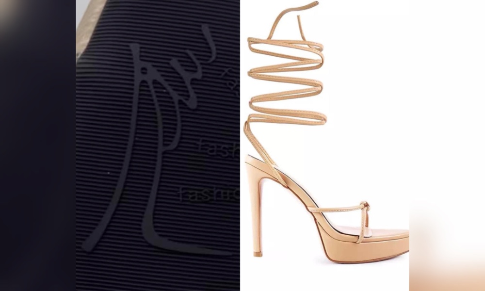
The logo on the soles of shoes produced by Vern's brand, allegedly resembling the word “Allah”, does not match the holy word in terms of “khat” (a form of Malay-Arabic calligraphy), said Nor Azlin Hamidon.
Nor Azlin, who is a lecturer in Visual Art Culture Studies, Islamic Art and Calligraphy from Universiti Teknologi Mara (UiTM), said this was because the logo has excess lines which damage the writing of the word “Allah”.
“From the point of view of the ‘khattat’ (calligrapher), the logo does not conform to any traditionally accepted calligraphy method, and the design is in the category of free calligraphy.
“It is possible that it was not intentional from the design aspect of the high heels,” the deputy president of the Persatuan Seni Khat Kebangsaan told Bernama today.
A three-minute video has gone viral on social media, in which a man claimed that Vern's shoes he purchased displayed a logo believed to resemble the word “Allah”.
Commenting further, Nor Azlin said confusion occurred when the shape of the logo only drew two outlines of the body of high heels, and a loop or rotation line representing the straps, as stated by the famous shoe brand.

“The shape of the rotation of the ankle spiral wrap on the logo looks like the complete word of ‘Allah’, especially in the form of a line that looks like the writing of the Jawi letter 'ha' (the end of the rotation which is connected to the shape of high heels).
“That is an additional shape which makes the point of problem in the form of the word ‘Allah’.
“The rotation line is also thin on the first rotation line, as if it resembles the writing of the Jawi letters 'alif', so that it looks like it is almost disconnected or not connected. That is why people interpret it as resembling the word ‘Allah’,” she said.
However, Nor Azlin said if the logo design was not intentional by the shoe brand, then it needs to be fixed to prevent this sensitive issue from continuing.
The academic also hopes this issue will serve as a lesson, and will not be repeated by designers of goods or products in any field.
Don’t lash out hastily
Meanwhile, the president of the Persatuan Seni Khat Kebangsaan, Abd Rahman Hamzah, said the sketch or design written on the soles of the shoe is not clear, and unrelated to the word ‘Allah’, in addition to the shape being too vague, and there are many possibilities to interpret the logo.
“This issue is similar to the shape of the letter 'T' or '+' (sign of the cross) on the pattern or decoration of Islam, which is associated with the sign of the Christian cross.
“We should not lash out easily; not all the letters 'T' are the sign of the cross. Islamic geometry also has many forms similar to that for ages,” he said, adding that it is only appropriate not to prolong the matter.
‘Like a speech taken in half’
Meanwhile, Universiti Malaysia Terengganu (UMT) Islamic Studies, Syariah, Fiqh Wa Usul and Quran lecturer, Abdul Hanis Embong, said that Muslims should not break the logo by only focusing on the loop that represents the spiral wrap, thus equating it with the word “Allah”.
The deputy dean (Talent and Research) of the UMT Foundation and Continuing Education Centre, is also of the view that it is not 100 percent equal to the holy word.

“If you look at the logo as a whole, you won't see (the word ‘Allah’). That's why we shouldn't break it. Any logo, if broken, can cause misunderstanding. It's like any speech when taken in half, the context strays.
“The shoe company has already explained. So, as a rational person, we can look at his justification... because if you follow what was explained, it is the heel of the shoe and ankle spiral wrap.
“So, it makes sense considering that it is a company that manufactures shoes,” he said.
- Bernama


No comments:
Post a Comment
Note: Only a member of this blog may post a comment.