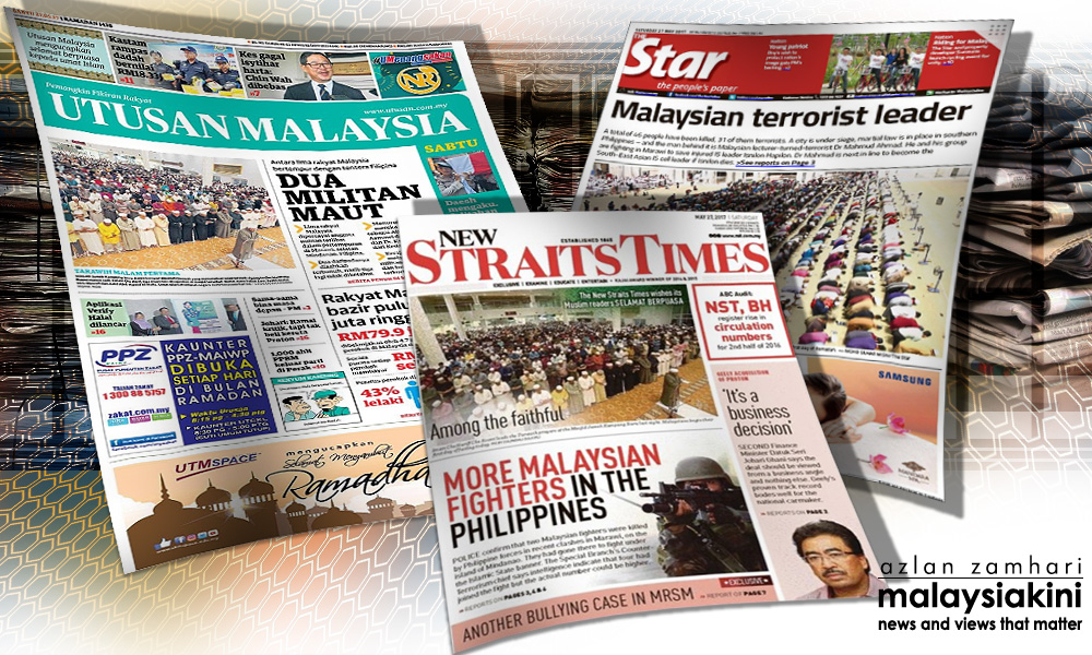
On the same day The Star front-paged a photograph of Muslims praying to welcome the month of Ramadhan below an unrelated headline on a Malaysian terrorist leader, two other local dailies - Utusan Malaysia and the New Straits Times - featured a similar combination of texts and images.
However, only The Star courted flak.
Political groups from both sides of the divide condemned the MCA-owned daily for being insensitive, while the Home Ministry summoned its top editors for an explanation and slapped the publication with a show-cause letter.
However, media groups and journalists have called for an end to the string of actions, which also saw the suspension of The Star's editor-in-chief Leanne Goh Lee Yen and executive editor Dorairaj Nadason.
Malaysiakini speaks to several experts on the issue.
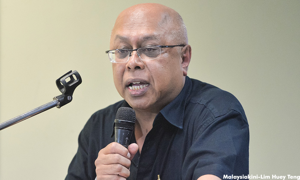
 Media studies professor Zaharom Nain (photo) believes that to the average reader, there is no difference between the front pages of all three newspapers.
“You may wish to quibble with headline size, for example, but perhaps only if you are terribly shortsighted or going blind,” Zaharom said.
Arguing that the issue has been blown out of proportion, he proposed that those who reacted strongly against the frontpage be “interrogated as well to see what really is insulting and why”.
“I wouldn't say 'people' were generally outraged by The Star's cover, but some people deliberately decided to feel outraged,” he added.
Zaharom's views were echoed by design lecturer Nicola Wong, who has been teaching graphic design for the past 11 years.
“I think the sensationalisation of that particular day's cover page was more to do with other external opinions of the content rather than the design,” she said.
Wong explained how the design of the front page of The Star, as with Utusan Malaysia and the New Straits Times, was “textbook in nature”.
“Textbook publication design with a standard masthead on the top, a main headline with an article, a secondary article in the form of an image and adverts in the footer,” she explained.
Wong disagreed with remarks made by some, including activist and graphic designer Fahmi Reza, that the image’s caption was too small to be seen separately from the headline.
“The photograph's caption is the standardised size that The Star has been applying since this version was launched a long time ago. One does not simply alter the master grid design that has been set,” she said.
'Size of image that enraged readers'
However, Universiti Malaya graphics and arts lecturer Nur Yuhanis Mohd Nasir held the view that it was the size of the image that confused, and thus enraged, the readers.
“At first glance, as a reader, I thought that the photograph was related to the headline - 'Malaysian terrorist leader'.
“Which news was supposed to be the highlight of the day? The headline or the news related with the photo?
“If the first news was more important, the size of the photo should be smaller. In newspaper (design), photographs are an important element because they anchors the story,” Nur Yuhanis told Malaysiakini.
In comparison to the other two covers, she said, The Star focused only on one headline “using a large sized font, which attracts people's attention to the news”.
“While New Straits Times and Utusan had a few other news going on in (the front) page,” she added.
The police are investigating the matter under the Sedition Act 1948 and Section 298A of the Penal Code for attempts to incite religious disharmony.- Mkini


No comments:
Post a Comment
Note: Only a member of this blog may post a comment.