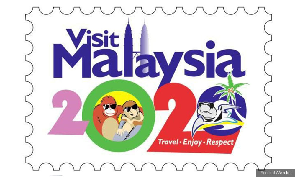
Dr Mahathir Mohamad may have a grand vision for Malaysia come 2020, but the unattractive Visit Malaysia Year 2020 logo is probably not one of them.
For starters, he was not convinced that the two orang utan in sunglasses, featured prominently on the logo, were a good idea.
"It looks like a kera (monkey) or is that a human? This is how they attract people to Malaysia.
"I think people will find it odd. Maybe some people will find this peculiarity interesting. I don't know," said Mahathir is a video clip posted on his Twitter page today.
Promotion material for the Tourism Ministry's Visit Malaysia Year 2020, launched at a regional tourism conference last week, has been mostly panned by online critics.
Many graphic designers have pointed out how amateurish the work is and how it violated design principles. Many designers even came up with alternative designs.
However, Tourism Ministry Nazri Abdul Aziz (photo) said the matter was not up for debate and the logo will not be changed.

Mahathir, who is a doctor by training and led the country for 22 years as prime minister, conceded that designing a logo was not his forte but believed that there were surely better choices out there.
"To me, there are a lot more designs which look nicer and more attractive," said Mahathir, who is now leading Malaysia's biggest opposition bloc.
In a related development, Grafik Malaya, a Facebook page for local designers, curated dozens of alternative logos in the hope that the authorities would change their minds.
"This is how (designers) are speaking up. We believe the Visit Malaysia 2020 logo [...] is inappropriate and weak.
"A logo is of paramount importance to the image of a country," said the anonymous Facebook page curators.
-Mkini


No comments:
Post a Comment
Note: Only a member of this blog may post a comment.