One of the critical aspects of this pandemic is having meaningful and granular data that can be used to make decisions.
We are very thankful to the Covid-19 Immunisation Task Force (CITF) and the Health Ministry for the data made available on GitHub. It has been useful to help understand the pandemic and many bright Malaysians have given us some good analysis from that data set.
However, meaningful data has three characteristics: they must be transparent, granular and timely (or “in real-time”). We understand the struggles to post real-time data and we have improved somewhat with data transparency. But we still have no access to granular data.
Without granular data we are unable to understand the needs down to the district/state level, cannot get a profile of risk, have difficulty monitoring the outbreak regionally, and may not be able to respond to local health service needs.
Granular data is required to answer the many questions the public have, such as: Is testing adequate in my district or state? Are the health services coping well in my district or state? Which hospitals need our help the most?
Who is most likely to get severe illness? What is the risk of severe illness to young adults and children with the Delta variant? How effective is vaccination at preventing severe illness? And many other questions.
Data (metrics) limitations in monitoring outbreak
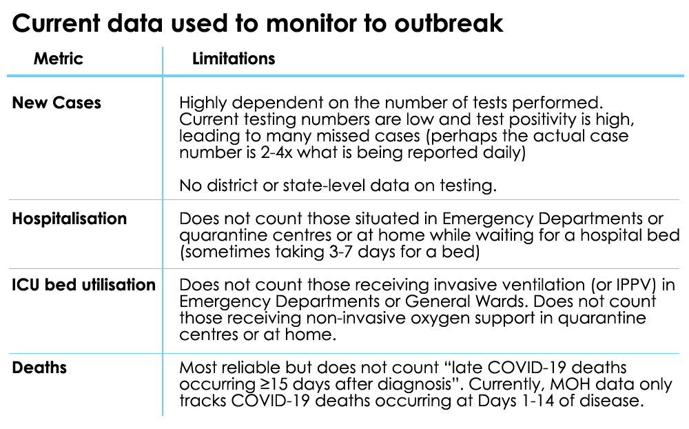
The figure below summarises the issues with the data that is currently used and shared with the public.
1. Daily case numbers
Daily case numbers are what the public looks at and are often used to describe worsening (situation) or improvement. But case numbers are entirely dependent on testing numbers.
No data on testing numbers by district or state is made available so we have no idea of what case numbers mean by district or state.
The national test positivity rate has remained high (10-15 percent for the past three weeks) indicating that the overall testing numbers are far too low and we are missing many who are positive.
2. Hospitalisation number
This could be a better indicator to tell us what is happening but it becomes of little value once hospital beds are fully occupied. Those in the emergency departments or waiting to get admitted from quarantine centres are not counted. So it can give a false idea of the situation.
3. ICU bed utilisation
The use of intensive care unit (ICU) beds should be one of the best metrics to monitor the situation but it becomes meaningless once the ICU beds are fully occupied.
Those on ventilation in the general wards and emergency departments are currently not counted, and neither are those on non-invasive ventilation (NIV) waiting in quarantine centres or at home. So we are not given a clear picture of the situation.
For example, in the Klang Valley, for every person in an ICU bed, there are possibly two-three who need an ICU bed but cannot get it. This also applies to many states outside of the Klang valley like Kedah, Perak and Sabah.

4. Deaths
Death numbers are the most reliable data but it is delayed data and is a lagging indicator (two-three weeks from infection). Additionally, late Covid-19 deaths are not counted (died ≥15 days after diagnosis). In addition, we hope all unexplained deaths at home are tested for Covid-19.
Useful parameters to monitor
Outlined below are some useful parameters to monitor the outbreak. Our health staff are overloaded and we need to bring in manpower from other ministries to help collect and upload these data.
1. Severity of illness by location daily
A useful data set to monitor would be the category of illness for those Covid-19 positive (Category 1 to 5) and deaths (including brought in dead) by location and district/state.
This means having data on where Category 1 to 5 patients (and deaths) are located (ie which facility, either in an ICU, general ward, Emergency Department, quarantine centre or at home). This is required by state and district.
If we see all our Category 4 to 5 patients are in an ICU and all our deaths occur in hospital, then we know the health service is able to cope. If we see most of our Category 4-5 patients are dying at home, then we know the health service has lost control.
This data will also inform civil society which region is decompensated and require support.
2. Highest severity of illness
Ideally, we require the highest category of illness (Category 1-5 and death) after Covid-19 infection by all granular variables - location (facility), age, sex, ethnicity, comorbidity, state, district and stratified by detailed vaccination status (no vaccination, one dose, two doses, 14 days after second dose, type of vaccine).
This data will enable us to answer many questions on vaccine efficacy, the risk for severe illness and death, among others.
3. Detailed testing numbers
Providing testing numbers by district and state would help make sense of daily case numbers and show the adequacy of testing. Even more valuable would be to show data on contact tracing.
Specifically, we must answer these questions: of those confirmed positive, how many contacts were identified? How many contacts tested positive? And how fast was contact tracing done from positive confirmation to final contact informed?

4. Vaccination data by granular variables
While we have general data on vaccination, we lack details – age, sex, ethnicity and comorbidity by locality. This granular data is vital as we try to reach every adult in our community.
It offers a profile of who has accepted vaccination and helps to identify those who need vaccination.
Elected representatives and others can then work to target groups that are vaccine-hesitant or missed, to boost our vaccine uptake.
5. Collateral deaths
It would be important to monitor collateral morbidity and mortality for other non-Covid-19 conditions; ie those who had some other illnesses and had a worse outcome as they could not get appropriate care. This will offer data to allow rebalancing of our health service.
In summary, choosing the most meaningful and appropriate indicator to monitor our pandemic will allow for a better grasp of its severity, where additional resources are required and when regions can have further relaxation of standard operating procedures.
When services are overrun, the Covid-19 clinical category and deaths by facility daily is an important metric to add to our data transparency efforts. - Mkini
DR AMAR SINGH HSS is a consultant paediatrician and DR KHOR SWEE KHENG specialises in health systems and policies.
The views expressed here are those of the author/contributor and do not necessarily represent the views of MMKtT.


No comments:
Post a Comment
Note: Only a member of this blog may post a comment.