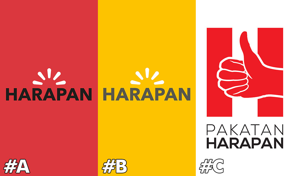
The logos proposed for the Pakatan Harapan coalition are so "rotten" that artist Yee I-Lann has declared a "national emergency".
Yee, an internationally-recognised artist from Sabah, urged Malaysia's graphic designers to step in to rescue the day.
The three proposed logos, one of which features a "thumbs up" sign, were uploaded for public voting on PKR vice-president Rafizi Ramli's Facebook page.
Harapan is seeking to register the coalition with the Registrar of Societies, so it can contest under one banner in the forthcoming general election.
 "Matter of national emergency, please, please, wonderful graphic designers of Malaysia, please help Harapan make a proper decent logo.
"Have you seen the ones being proposed? Oh my God, we need to train political parties (on) how to use graphic design.
"Harapan, your new logo proposal gets an F. Has anyone got the time to do a proper breakdown analysis to tell them why their design sucks rotten eggs? I ask in all seriousness; so fail (sic)," she said on Facebook.
Graphic artist Fahmi Reza also responded with disdain.
He proposed a fourth option - a version of the 'thumbs up' logo, but with the middle finger instead.
The others commenting on Rafizi's posting were no more positive about the situation.
"This is the shortlist? There is no art in any of them. Why not run a contest to seek ideas from the rakyat.
"Logos are not something you can just do half-heartedly. These look like logos from the 1980s, with no creativity. Please review this," said Facebook user Hantwo Dimana.
He added a hashtag #CapKacangNganNgin, believed to be a reference to the logo of the popular peanuts brand "Ngan Yin", which features a "thumbs up" sign.
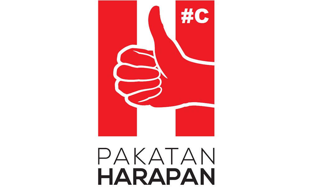
One of the three logos features a red "thumbs up" sign, in front of a vertical red and white stripes, above the words "Pakatan Harapan".
The other two logos feature the word 'Harapan' in capital letters, with what appears to be rays of light above it. These proposals come in yellow and red background variants.
"What is squirting out at the top? Run a contest so you'll get a better logo. This is someting that will be used for a long time, so invest more into it," said netizen Nazri Shah.- Mkini


No comments:
Post a Comment
Note: Only a member of this blog may post a comment.